Carbon Emissions around the World
Data visualization
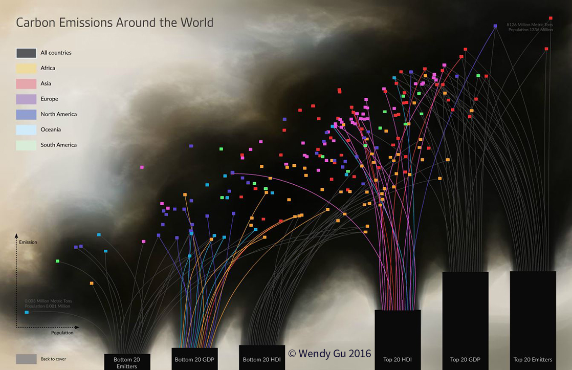
The project is an interactive visualization of 2011 global carbon emission data. This data visualization piece examines each nation's carbon output against their population. Additional correlations were made to the top and bottom 20 GDP and HDI rankings from the same year.
This project served as a study of design principles through careful use of elements such as repetition, similarity and contrast, luminance, hue and saturation, to increase saliency and direct audience gaze and navigation.
Explore the interactive version